Graphic Design + Church: The Problem with Size and Color
What is art and design for church? How do you describe it? Historically, art and design for church have resulted in physical objects. Paintings come to mind first for me, having specific size and color. One object communicates ideas in a visual way. I also think of architecture. You can measure it, study the structure, see what materials are used on the physical surfaces. From time to time, I find in conversations about art, that many people still perceive all art as single objects with specific color, dimension, and means of display. This just often isn't true for digital art and graphic design. It is often a fluid thing. When sitting down to plan out or discuss a digital art project, starting by describing size and color concepts can be problematic.

Digital design pushes the boundaries of the normal physical descriptions of art. Is it black and white? Is it color? Is it portrait or landscape orientation? Is it large scale or small scale? Is it for print or is it for screen? When using digital art, all or most of the above might be true. Because we can manipulate images quickly and push them out to social media platforms or online printers, our need for more flexible design grows.
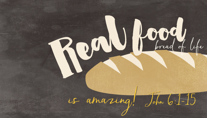
For example, you may want artwork to coordinate with an upcoming sermon series. Where is that artwork going to go? Worship folder? Screen in church? Facebook? Website? Flyers around church? What about a yard sign to invite in the neighbors? Often times, it is all of the above. Just as in the past, you started with an idea that could be represented in a visual way, but ended up with many pieces and versions instead of one object. You have a combination of physical and digital images, viewed at different scales and in different color modes.
Worship folders are often printed with black ink, but not always. Most churches prefer low-ink options, and perhaps use a TIF file format. The digital screen in a sanctuary requires hi-res images in JPG format, full color, with a landscape orientation. Facebook cover photos require a landscape image in JPG format as well, but with proportions that are different from the church screen. Meanwhile, a Facebook newsfeed or Pinterest pin work better with a vertical orientation and members can share the upcoming series information from there. Printed flyers also require a vertical orientation, but while websites and social media need RGB color mode at 72 dpi, a printer requires 300 dpi and CMYK color mode - maybe in PDF or PSD. A street sign can also be printed in CMYK color mode at 300 dpi, but that's back to landscape orientation again. In addition, people can only read so much information on a street sign while they are driving by, so the amount of words on the street sign and the flyer aren't going to be the same. Likely, a vector logo file is thrown into this mix as well, probably an AI or EPS.
All I'm saying is that digital art often has many changing properties. It is hard to really focus on size and color, because that might change even with one art concept. What stays the same? The idea. The idea is the constant in art.
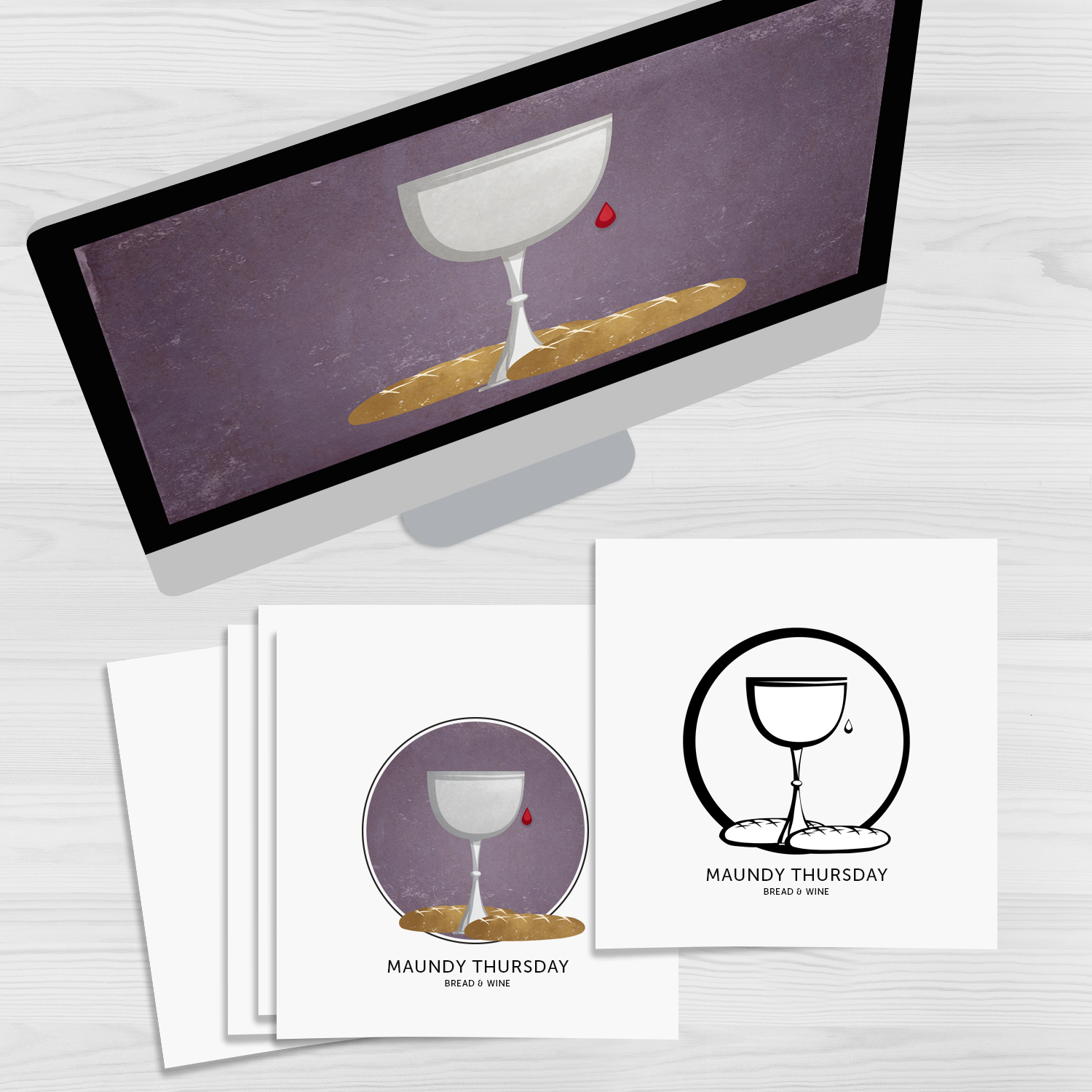
While this worship art is about one idea, it is available in different forms, because the formatting needs change depending on the way it is being used. The needs for screen versus the needs for black print on paper or color print on paper are different.
When it comes to thinking about graphic design for your church - whether it is in logo design, branding, event PR, or artwork for worship, the idea behind it all is the essential component. The other properties follow. Size and color are of secondary importance. Sure, some of the forms will most likely hang together throughout, but what is your message? As art and technology come together going into the future, I'm confident that things will continue to change. Our favorite means of displaying art in worship might change, the types of screens we use might change, the most effective social media platforms will change. The way those platforms display information will change. It will continue to be a dynamic area that's hard to keep up with.
Despite all the change, the need to communicate an important message in a clear way stays the same. Where that happens, and how that happens might change. So, if you are wondering where to start with art and design for your church, don't first worry about what color it is, what size it is, or the future of technology. First, focus on what you want to say. Whether it's in pictures or with words, your message is timeless.
For further reading on changing design trends:
The 9 Graphic Design Trends You Need to be Aware of in 2016 from Canva
Fall 2016 Pantone Fashion Color Report
10 Brilliant Graphic Design Trends of 2016 from Creative Market