Basic Flyer Design: Implementing Your Concept
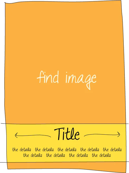
After reading Basic Flyer Design, First Keep it Simple, and watching for new ideas in your community and online, you may be ready to take your inspiration for a test drive. As mentioned in the article above, you hopefully have a couple of painfully simple concepts ready to try, complete with little napkin sketch diagrams like the one below. Now what? 1. Find your artwork.
A number of resources are out there online where you can find photos, clipart, and artwork for use in your flyer. Even if you are a non-profit or individual, you need to follow copyright laws. Creative Commons is a fantastic resources for becoming more familiar with those restrictions, and also for linking to content that has been made available for your use. Many materials are in the public domain and can be used freely by you in your flyers. You can find various types of media through Creative Commons and also browse photography in the public domain on Flickr Commons.
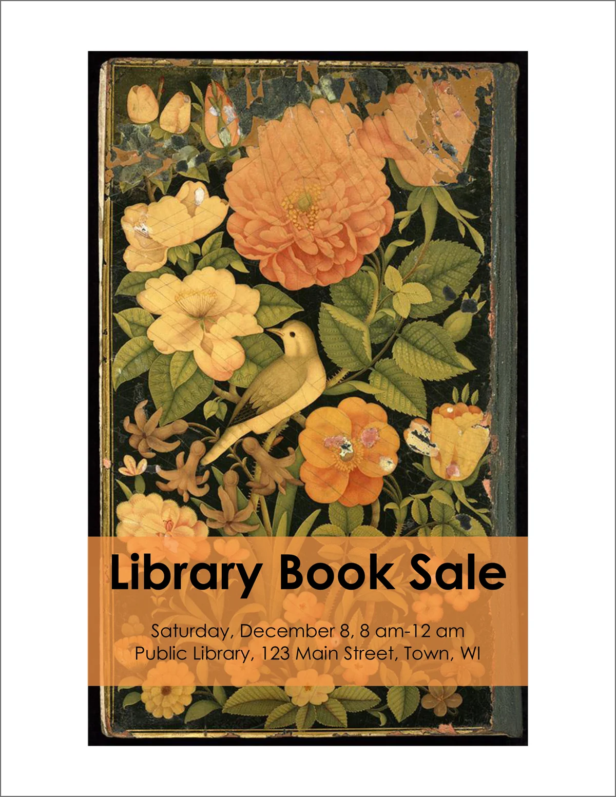
Download a handful of images you may like to use. I often try out more than one image to see what works best. Look for images that are related to your content and have an appropriately high resolution. If you insert the image into your document and it looks tiny, requiring you to enlarge it quite a bit for use, it is too small. A pixelated or watermarked image is not appropriate to use. The flyer design below is for a hypothetical library book sale, and uses an image of a book binding found on Flickr Commons.
2. Plug in Your Content
You have already pre-determined where the pieces of your flyer will be going, using your napkin sketch diagrams. (See Basic Flyer Design: First, Keep it Simple) This is the stage where your planning and practice will pay off more and more as time goes on. Let's try to put those new ideas into action.
This basic flyer sample was created using Microsoft Word. I'm going to assume you have a general working knowledge of the program already, and will show you just a couple of my favorite tools and settings to help you along. If you need a little more time to get familiar with the program first, you can find tutorials here to walk you through some of the basic features.
I like to lay out my Word flyers using only inserted images and text boxes. This way, the objects can more easily be moved around the page and manipulated as needed. This sample poster is made using only two objects: the image and the text box.
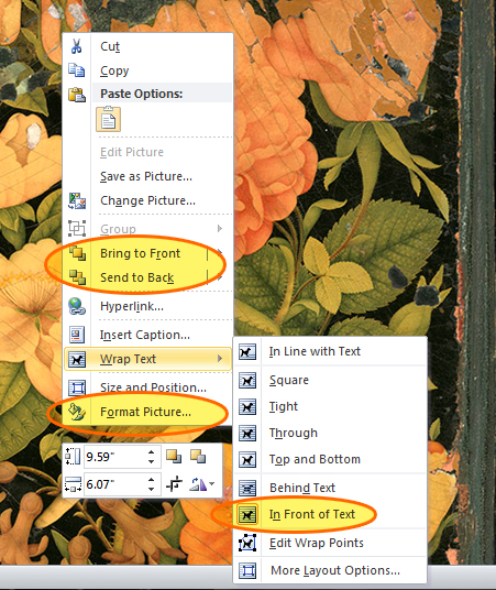
After inserting an image or text box, I right click on the object, and set the options. In the screen shot below, I've highlighted my favorite menu options.
I set the text wrapping on all of my objects to "in front of text" and set the border option to "none" under "format picture." Using the "bring to front or send to back" options helps you layer your objects as you need them.
To achieve the bar of color, you could either insert a new shape behind the text, or set the text box color to your desired color. In this sample, I have the text box color set to a dark orange. Then, under "format shape > fill," set the transparency to 25%.
When selecting your font, make sure that it is legible. It is much better to err on the side of a boring typical font than it is to try a fancy font that is hard to see. This font is Century Gothic. Don't use more than a couple of fonts on one flyer.
In this sample, I have intentionally left a white border around the outside of the flyer as part of my composition. This allows for printing on a personal printer without worrying about the bleed and margins interfering with the design. You most likely cannot have a full bleed poster printed at home or in your office. If you do, however, want full bleed, a number of websites have the option, such as Shutterfly. If this is the option you'd like, you will need to have a jpeg file to upload. Power Point has a jpeg file type option under "save as."
A number of programs can be used for making flyers. I have done this sample with Word, since many offices already have it. I prefer to use the Adobe Creative Suite. Some other options you might use are:
- Power Point
- Gimp, a free downloadable program
- Open Office, a free alternative to Microsoft Office
- Photoshop Express, free online photo editing tools
3. Review Your Design
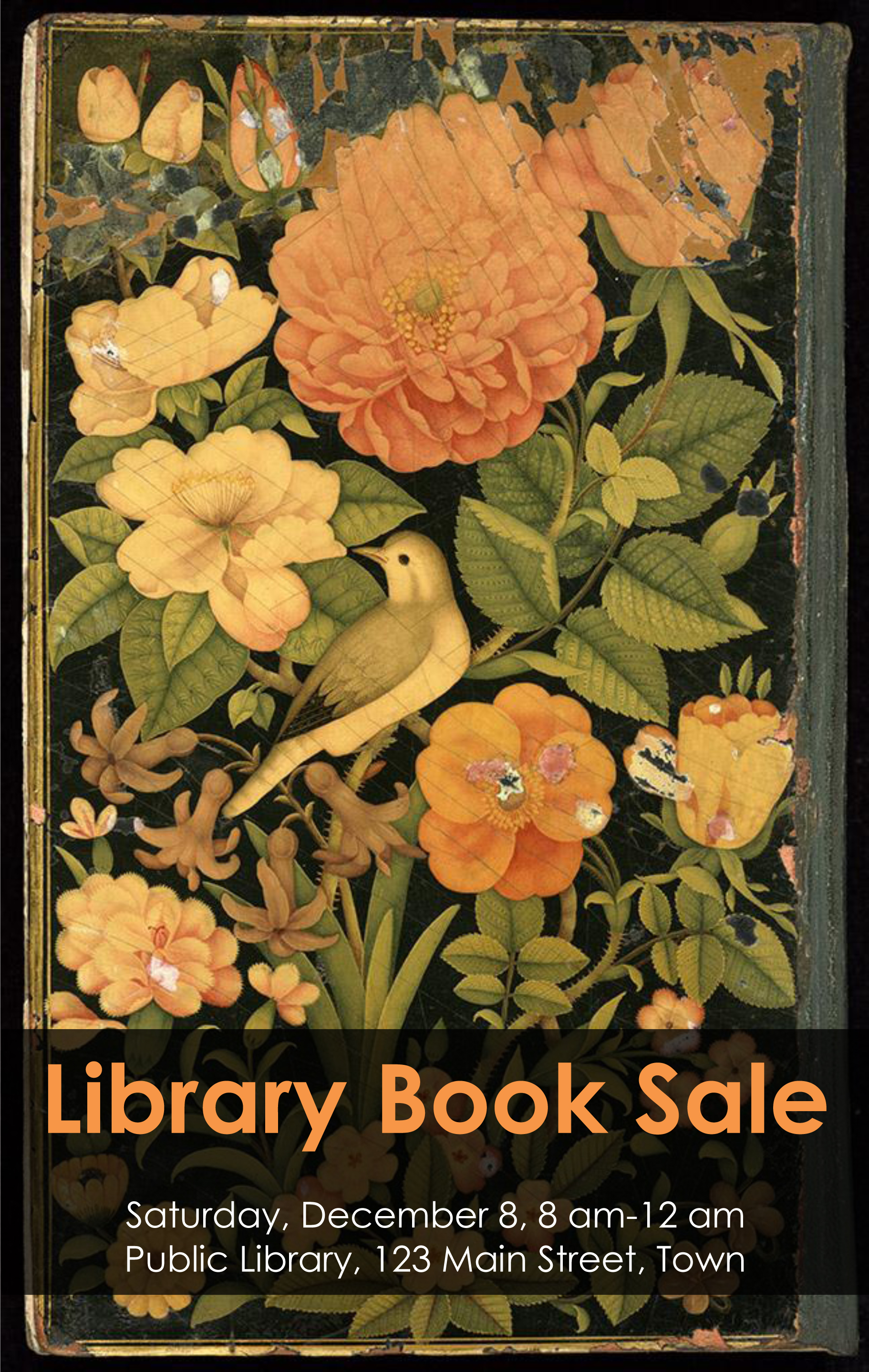
As you work, ask yourself if you are still following the guidelines in Basic Flyer Design, First Keep it Simple. Is it simple? Is your message clear? After reviewing the above flyer, I felt the text wasn't quite as legible as it could be, and adjusted the design to have less contrast behind the text.
Over time, you will adopt some favorite tools, resources, and diagram types, making the job even easier.
Have you found some nice resources for flyer design? Please feel free to share below.